// CASE STUDY — BRAND WEBSITE
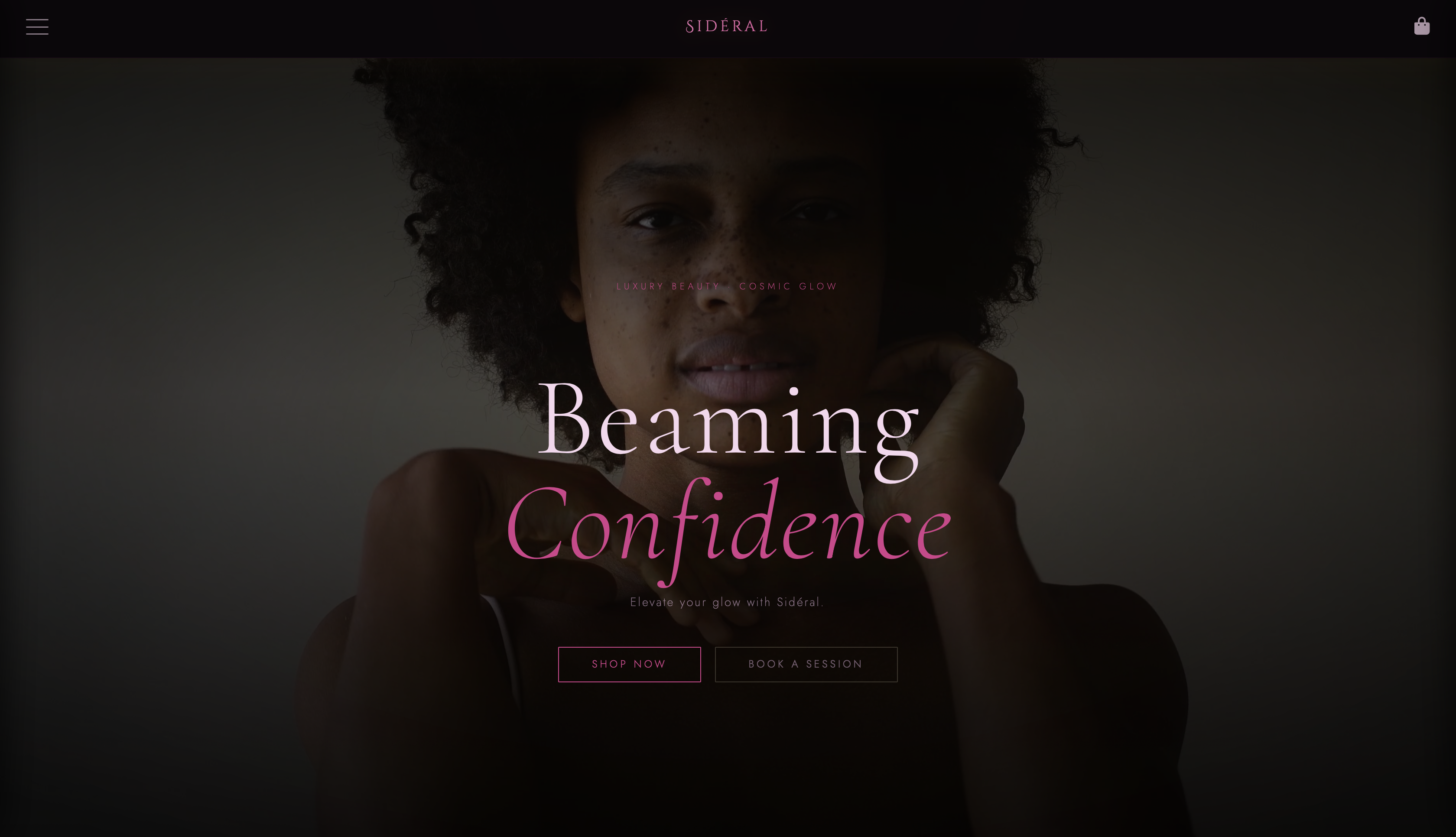
A luxury beauty brand site designed and built from scratch — combining a cosmic visual identity of deep purples and soft pinks with a fully functional storefront and booking experience.
. View Live Site View Figma File
// 01 — The Problem
Most luxury beauty websites prioritize minimalism to the point of feeling sterile and distant. They look expensive but don't feel immersive or personal. The challenge was to create something that felt premium and high-end while also pulling the user into a world — a brand experience, not just a storefront.
// How do you make a beauty brand feel like an experience rather than a transaction?
// 02 — Design Approach
The name Sidéral — meaning "of the stars" — drove every design decision. Deep space colors, celestial imagery, and dark backgrounds create an atmosphere that feels otherworldly and aspirational without losing approachability. The goal was a brand that a user could get lost in.
Typography was chosen to balance elegance with legibility across product listings and booking flows. Color contrast was carefully maintained throughout to ensure the dark palette never compromised readability.
// 03 — What I Built
Sidéral isn't just a landing page — it's a complete brand experience with multiple interconnected systems built in vanilla HTML, CSS, and JavaScript.
// Feature
Product Storefront
// Feature
Shopping Cart
// Feature
Booking System
// Feature
Responsive Design
Building the shopping cart and booking system without a framework required careful state management in vanilla JavaScript — tracking cart items, quantities, and session data entirely through the DOM and localStorage.
// 04 — Outcome & Reflection
Sidéral taught me how much visual identity drives user trust. Small decisions — the weight of a heading, the spacing between product cards, the timing of a hover animation — compound into a feeling that either earns a user's attention or loses it. This project sharpened my eye for that gap between a site that looks designed and one that feels designed.