// CASE STUDY — AI APPLICATION · LIVE
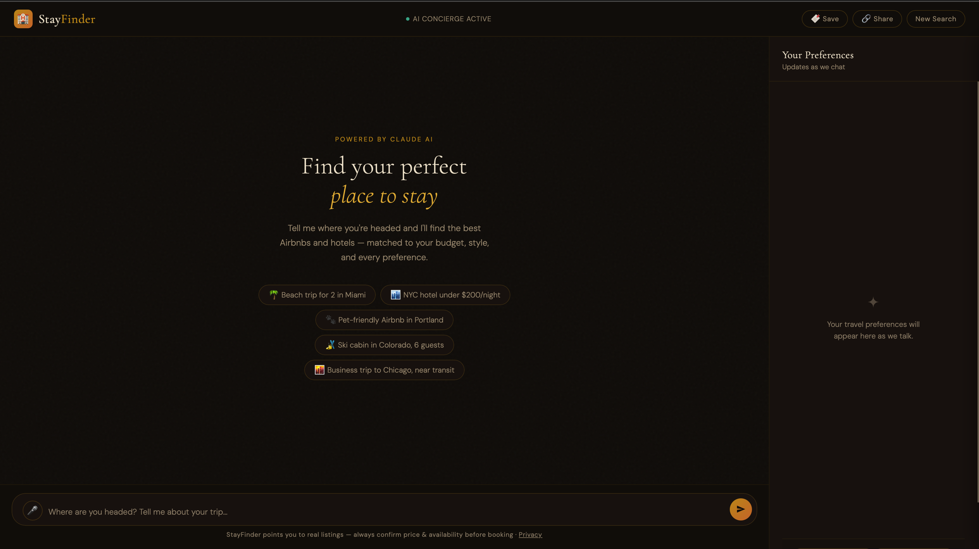
An AI travel concierge built around a simple bet: the more options a filter-based search surfaces, the harder it becomes to actually choose one. StayFinder replaces the filter panel with a conversation, then finds live Airbnb and hotel listings, drops them on a map, and lets you compare your favorites side-by-side.
// 01 — The Problem
There's a well-documented effect in decision psychology called choice overload — past a certain point, adding more options doesn't make people more satisfied with their decision, it makes them less confident in it and more likely to second-guess or abandon it entirely. Booking sites are built almost in defiance of that finding: location, price, dates, guests, amenities, cancellation policy, host rating, and on and on, each filter narrowing the list while widening the mental load of the person using it.
Nobody plans a trip by thinking in checkboxes. You think in a sentence — "somewhere walkable to the beach, pet-friendly, under $200 a night, room for the dog" — and then you spend twenty minutes translating that sentence into a form. StayFinder skips the translation step.
// If more filters make people less confident in their choice, why is filtering still the default interface for booking a trip?
// 02 — Design Approach
The core interaction is a chat with Claude that asks the right follow-up questions — destination, dates, guests, budget, vibe — and searches real listings once it has enough to work with. The design challenge wasn't the chat itself; it was making an AI-driven flow feel trustworthy and legible rather than like a black box.
A live preference sidebar solves that. As the conversation progresses, a running summary fills in — destination, dates, budget, amenities — so the user always sees exactly what the AI understood, with a progress bar toward "ready to search." Results land on an interactive map with clickable pins, and any two or three listings can be pulled into a side-by-side comparison table with best-price and top-rated call-outs.
// 03 — What Shipping Taught Me
The interesting growth on this project happened underneath the interface, rewriting decisions I'd made too quickly the first time through.
My first version called the Anthropic API directly from the browser with
the key sitting in localStorage — fine for a demo, unshippable for real
people. I rebuilt the whole request flow behind a Vercel Edge Function so
the key never leaves the server. I also moved off regex-parsed
<TAGS> in plain text and onto structured Claude tool
calls, so the model returns typed, reliable data instead of me hoping
its output matches a pattern.
// Security
Server-Side Proxy
// Reliability
Structured Tool Calls
// Design System
Figma Token Sync
// Resilience
Graceful Demo Fallback
// Abuse Protection
Rate Limiting, Fail-Open
// Product Ethics
No Fake Booking Flow
Before the link went public, I added per-IP rate limiting at the edge and a hard monthly spend cap — the cap exists specifically as a backstop in case the rate limiter itself ever fails. And when it does fail, it fails open: a Redis hiccup degrades to an unthrottled request rather than taking the whole app down. That's a deliberate tradeoff between cost protection and availability, not an oversight.
I also learned that owning a mistake is part of the job. An early commit accidentally hardcoded a live Mapbox token directly in the client-side code. Instead of quietly fixing it, I documented the token as burned in the deployment notes, rotated it, and wrote down why — so the next credential doesn't end up in a commit either.
The most deliberate decision in the whole app might be the smallest one: there's no "Book Now" button. Real booking requires affiliate-level API access I don't have yet, so rather than fake a booking flow that can't actually confirm a reservation, every listing links out to a real search on Airbnb or Booking.com. It's a permanent product decision, not a launch-week shortcut — an AI product should never let a confident-sounding interface promise something it can't back up.
On the design side, colors, spacing, and type are defined once as design tokens and synced straight into Figma via Tokens Studio, so design and code don't drift apart as the app grows. And because the app should never just be a blank, broken screen, it falls back to a fully working demo mode if the backend isn't reachable — no API key, no problem.
// 04 — Outcome & Reflection
StayFinder is deployed and usable today, not a mockup sitting in a design file. That distinction mattered to me — it's one thing to design a flow, another to see it survive contact with a real API, real network conditions, and real edge cases. Getting it from "looks right in Figma" to "works when someone else opens the link" was the actual project.
The goal was to make vacation planning feel less like a second job — for someone booking their first trip or their fiftieth. It's still evolving, and the repo is public if you want to see exactly how it's built.